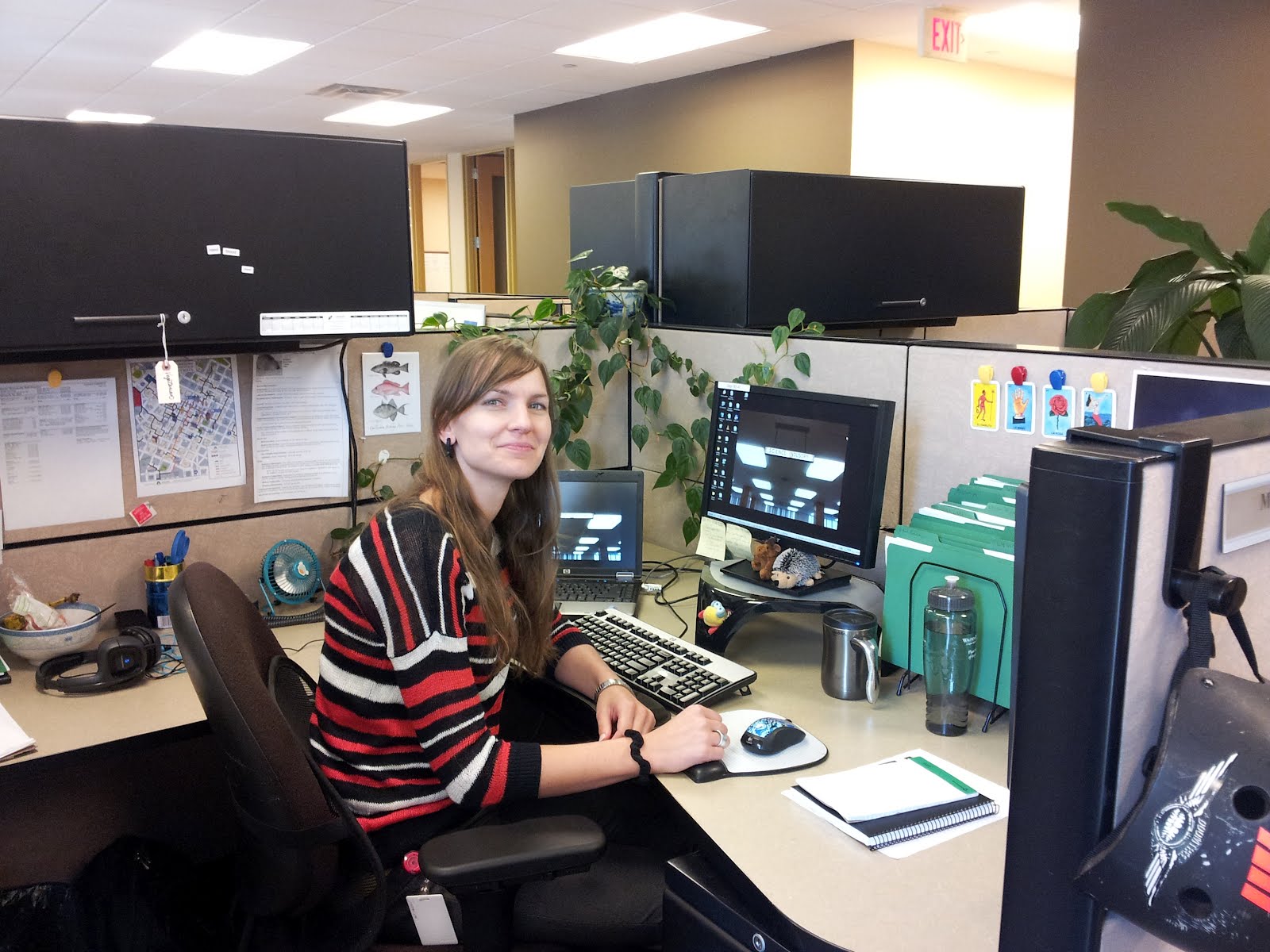
Here I be in my staged-tidy cube in Walden University Library. Contrary to my pastiness in this photo, I did see the light of day this summer, I swear! But it’s been a breakneck speed, productive past several months, with two major accomplishments:
1. Website user testing
I’m on a team that has been developing a reorganization for the library website. The design will stay largely the same, but the current site has significant usability problems, mostly due to poor labeling and non-intuitive categorization—legacy decisions that leave us with loads of library jargon and way too many assumptions about user know-how.
Inspired by user experience discussions at MinneWebCon and Steve Krug’s Rocket Surgery Made Easy, I advocated for user testing and won—to my delight and terror. Without a user testing precedent in the library or elsewhere in the university as far as I could determine, I was on my own. Though some decisions were less than ideal, like using other staff as participants instead of actual students (it’s an online university, hey… can’t exactly post fliers by the washrooms), the pilot test proved most useful.
I designed and conducted the tests with input from two colleagues, also on the website team. We opted to get feedback on the existing site to confirm our suspicions about things that are confusing and to uncover new problems we hadn’t considered. The data collected was largely confirming but with plenty of the unexpected to keep it interesting.
Data was used to justify design decisions, to incorporate additional ones and to make a few emergency changes to the current site immediately—critical facepalms not fit to print. User testing overall was thrilling and embarrassing and yes, time-consuming, but at the same time so important, and despite the initial timesink, it wasn’t terribly complicated. With a process in place, future testing sessions can hopefully happen with greater frequency, and with our other user groups, like students and faculty.
2. A comprehensive style guide for all library content
The new website requires loads of revised and new content, the majority of which will be pushed through LibGuides, of which we already have a ton. A metric ton. An expletive ton, and honestly, sadly, they’re all over the place when it comes to consistency.
Consistency is quality—inescapably. But with incomplete guidelines and several librarians producing content, the guides as a whole lack cohesion.
Now was my chance to reign in our over 2,500 guides, exploiting my English degree and proofreading background to the fullest. After investigating the university style guide and APA style (the university-wide standard), plus considering deeply the merits of common use and sense (e-hyphen-mail? really?), I created a content style guide governing every aspect of content creation, including:
- Grammar, spelling and usage
- Screenshot creation and specs for annotations (call-out boxes, arrows, highlighting, etc.)
- Link names and image descriptions (“alt tags”) that are mindful of screen readers to ensure all content is ADA compliant, or as close as we can get given tech constraints
The style guide applies across all platforms: the main site, LigGuides, LibAnswers, the blog, Facebook, YouTube, and all things to come. With the help of an instructional designer colleague, instructional best practices are included throughout.
The style guide is a thing of beauty—and was a wonderful exercise in choosing the fights worth having. I tend to lean toward the minimal. Serial comma?—hate it. But I let it go and let it inside. Two spaces instead of one between sentences? I knew enforcing a rule either way would cause a war, and didn’t even bother.
But killing the capital “I” on internet? Now that’s worth fighting for.
